
Building a Data Analyst Portfolio: 5 Projects That Actually Get Noticed
What Recruiters Actually Look For in a Data Analyst Portfolio
Building strong data analyst portfolio projects starts with knowing what recruiters actually look for. Recruiters scan a portfolio for one thing first: proof you can turn a messy, real dataset into a decision someone could actually act on – not proof that you can run .fit() on a clean CSV. Everything else (charts, code style, tool choice) is secondary to that core signal.
Across recent hiring-focused guides, a few priorities repeat consistently:
- Real-world skills over toy exercises. Hiring managers want evidence you can operate across the full analytics lifecycle – sourcing or cleaning data, exploring it, modeling or aggregating it, and communicating a conclusion – not just evidence you followed a tutorial.
- Business framing over technical complexity. The strongest portfolios lead with the business question (“Why did signups drop 18% in Q2?”) rather than the tool used to answer it. Outcomes stated in business terms (cost saved, churn reduced, conversion improved) read faster than accuracy scores.
- Visible reasoning, not just results. Recruiters want to see how you cleaned messy data and why you made specific modeling or metric choices – the decision trail matters as much as the final chart.
- Communication for non-technical audiences. Since much of an analyst’s job is explaining findings to stakeholders who don’t write SQL, portfolios that include a plain-language summary alongside the technical notebook stand out.
- Public validation. Projects that are shared, viewed, or discussed publicly (on Tableau Public, LinkedIn, or a blog) signal that the work holds up to outside scrutiny – not just a grade from yourself.
- Quality over quantity. Three to five deeply documented projects consistently beat a GitHub profile cluttered with a dozen half-finished notebooks.
If you are still building the foundational skills these projects require – SQL, Python, Excel, Power BI, Tableau, and statistics – a structured program like GrowthIntelliLabs’ data analytics course in Hyderabad can shorten the path from “learning the tools” to “having something worth showing.”
Why Titanic and Iris Projects Hurt More Than They Help
The Titanic survival classifier and Iris flower classification are the two most over-submitted portfolio projects in data analytics, and hiring managers recognize them instantly – which means they signal “followed a tutorial” rather than “solved a problem.” The same applies to unmodified Kaggle competition notebooks unless you placed competitively.
These datasets are clean, small, and pre-labeled, which is exactly why they were built for teaching – not for demonstrating job-ready skill. A recruiter reviewing dozens of portfolios a week has seen the same survival-prediction notebook with the same 79% accuracy score too many times to be impressed by it. The dataset itself is not the problem; the absence of an original business question, original data wrangling, or original judgment is.
The fix is not necessarily avoiding public datasets altogether – it is choosing ones that are messy, current, or under-used, and pairing them with a specific business question you define yourself, rather than a pre-set competition target.
5 Data Analyst Portfolio Projects That Actually Get Noticed
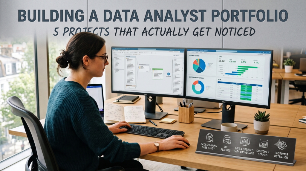
The five project types below cover the core skill areas recruiters screen for – SQL and data wrangling, dashboarding, live data integration, statistical testing, and end-to-end storytelling – so together they demonstrate range, not just repetition of one skill.
Pick projects from different categories rather than five variations of the same skill. A portfolio with one SQL project, one dashboard, one live-data project, one experiment analysis, and one end-to-end case study shows breadth that a hiring manager can map directly onto real job tasks.
1. A Messy, Real-World Data Cleaning Case Study
What it demonstrates: Most of an analyst’s actual job is cleaning and validating data before any insight is possible – yet this is the step most portfolios skip. A project built around genuinely messy data (inconsistent formats, missing values, duplicate records, mismatched schemas) proves you can handle the 60-80% of the job that never appears in tutorial datasets.
Source your data from somewhere it has not been pre-cleaned for you: government open data portals (data.gov.in, RBI statistics, city civic datasets), a scraped e-commerce or job-listing site, or an export from a small business’s spreadsheet. Document every cleaning decision – why you dropped a column, how you handled outliers, what assumption you made about a missing field – in your README, not just in code comments.
Tools to use: Python (pandas) or SQL for the cleaning logic, Jupyter Notebook or a well-commented .sql file to show your work, and a short written summary of before/after data quality (row counts, null percentages, duplicate counts).
2. A Live or Continuously Updated Data Dashboard
What it demonstrates: Working with an API and live data (rather than a static CSV downloaded once) shows you can build something that stays useful over time – a skill directly relevant to real BI work, where dashboards refresh daily or hourly. It also proves basic technical range beyond spreadsheet analysis.
Good source options include public APIs for air quality (OpenAQ), weather, transit or traffic data, energy consumption (US EIA or India’s open energy data), or financial market data. Build a dashboard that answers a specific question – “Which Hyderabad zones have the worst air quality on weekday evenings?” – rather than just displaying raw metrics.
Tools to use: Python for the API pull and scheduling (or a no-code connector), Power BI or Tableau for the visualization layer, and a cloud host (Power BI Service, Tableau Public) so the dashboard is viewable without opening a file.
3. An Executive KPI / Interactive BI Dashboard
What it demonstrates: This project mirrors the single most common real-world analyst deliverable: a dashboard a manager checks weekly to make a decision. It shows you can define metrics precisely, design for a non-technical audience, and build drill-downs that let a viewer self-serve answers instead of asking you follow-up questions.
Pick a domain with enough complexity to matter – retail sales performance, subscription churn, e-commerce funnel conversion, or hospital bed utilization. Define your KPIs explicitly in the dashboard (what exactly counts as “active customer”?), include at least one drill-down path (region → store → product), and add a one-paragraph “how to read this” note for a non-technical viewer.
Tools to use: Power BI or Tableau for the dashboard itself, SQL or Power Query for the underlying data model, and Power BI Service or Tableau Public to publish an interactive (not static-screenshot) version.
4. A Cohort, Retention, or A/B Test Analysis
What it demonstrates: This is the project that signals statistical maturity – the ability to design a comparison, check whether a difference is meaningful, and avoid overclaiming from noisy data. It’s especially valuable for candidates targeting growth, marketing, or product-analytics roles, where this exact analysis type is a daily task.
Use GA4 sample data, a public marketing dataset, or a synthetic-but-realistic campaign dataset to run a cohort retention analysis (grouping users by signup week and tracking retention over time) or an A/B test evaluation (comparing conversion rates between two groups with a significance check). State your hypothesis up front, show your test/metric choice and why, and end with a recommendation – “roll out variant B” or “retention drop is concentrated in the day-3 cohort, investigate onboarding” – rather than just a p-value.
Tools to use: SQL for cohort construction, Python (pandas, scipy, or statsmodels) for the significance testing, and a chart or short dashboard to visualize the retention curve or test result.
5. An End-to-End Business Case Study (Raw Data to Recommendation)
What it demonstrates: This is your capstone – the project that proves you can carry a problem from a vague business question all the way to a stakeholder-ready answer without hand-holding. It’s the single project a recruiter is most likely to read in full, so it should be your best-documented piece of work.
Pick a business question with real stakes: “Why is customer churn rising in the SME segment?” or “Which product categories should we discount for the festive season?” Walk through the full pipeline – raw/messy data, cleaning, exploratory analysis, a chosen metric or lightweight model, a dashboard or visualization, and a clear written recommendation with the trade-offs stated. This is also the project where advanced skills from a broader data science course in Hyderabad – like basic predictive modeling or Gen AI–assisted analysis – can meaningfully differentiate your work if you’ve gone beyond a pure analyst curriculum.
Tools to use: SQL and Python for the pipeline, Power BI or Tableau for the final visualization, and a written case-study document (PDF or blog post) that narrates the project the way you’d explain it in an interview.
Which Tools and Platforms to Showcase Your Work On
Host code and queries on GitHub, publish interactive dashboards on Tableau Public or Power BI Service, and use Kaggle notebooks for exploratory or statistical work – using each platform for what it’s actually good at, rather than forcing every project into one format, is what makes a portfolio look deliberate rather than scattered.
- GitHub / GitHub Pages: Best for SQL scripts, Python notebooks, and your project README. This is where technical reviewers verify your actual code and documentation habits.
- Tableau Public: Best for interactive dashboard demonstrations viewers can filter and explore themselves – strong for analytics-consulting, SaaS, and marketing-analytics roles that value storytelling with visuals.
- Power BI Service: Best if you’re targeting enterprise, finance, or operations roles, where Power BI appears far more often in job postings and pairs naturally with Excel experience.
- Kaggle Notebooks: Useful for exploratory analysis and statistical write-ups, especially if you rank well in a competition – a generic, low-ranking Kaggle submission adds little on its own.
- A personal site or Notion page: Optional, but useful as a single landing page that links out to your GitHub, Tableau Public profile, and case-study write-ups, so a recruiter never has to hunt across platforms.
Neither Tableau nor Power BI is a universally “correct” choice – Power BI shows up more often as a must-have on business analyst and BI developer job postings in mid-size and large companies, while Tableau tends to concentrate in analytics-consulting, SaaS product-analytics, and data-science-adjacent roles that lean more on storytelling. If you’re unsure which to prioritize, check the job postings you’re actually targeting and build your dashboard project in whichever tool appears more often.
How to Present a Project So Recruiters Actually Read It
A project only counts if a recruiter can understand what it does, why it matters, and what you concluded within about 90 seconds of opening it — which means presentation and documentation matter almost as much as the analysis itself.
Use this checklist for every project before you consider it “portfolio-ready”:
Frequently Asked Questions
What are the best data analyst portfolio projects for beginners?
The best data analyst portfolio projects for beginners are ones built on a real (not pre-cleaned) dataset with a defined business question – a data-cleaning case study, an executive KPI dashboard, or a cohort/retention analysis are all strong starting points because each teaches a distinct, job-relevant skill instead of repeating the same clean-CSV workflow.
How many projects should be in a data analyst portfolio?
Three to five fully documented projects is the range most hiring guides recommend, because quality and depth of documentation matter more to recruiters than the raw number of notebooks in your GitHub profile.
Should I use Tableau Public or Power BI for my portfolio?
Choose based on the job postings you are targeting – Power BI tends to appear more often in enterprise, finance, and operations roles, while Tableau concentrates in analytics-consulting and product-analytics roles, so check a handful of real listings before committing your dashboard project to one tool.
Do I need GitHub for a data analyst portfolio?
Yes, for any project involving SQL or Python code, since GitHub is where recruiters and technical reviewers verify your actual code, commit history, and documentation habits rather than just trusting a finished chart.
How do I write a good README for a data analyst project?
A good README opens with the business question and a short summary, explains the data source and cleaning steps, walks through your methodology in plain language, and ends with a specific recommendation – structured so a non-technical reader understands the project without opening any code.
Can I get a data analyst job with only portfolio projects and no prior experience?
A strong portfolio of 3-5 well-documented, business-framed projects can meaningfully improve your chances as a fresher, but it typically works best alongside structured training, SQL/Excel/Power BI or Tableau fluency, and interview preparation – results always vary by market, role, and individual effort, and no portfolio guarantees a specific outcome.
CTA
If you are in Hyderabad and want structured guidance to turn these data analyst portfolio projects into an actual, interview-ready portfolio, GrowthIntelliLabs offers hands-on Data Analytics and Data Science training out of its Kukatpally center, with instructor support on real-world datasets, dashboards, and project documentation. Explore the Data Analytics course or the Data Science course, or call +91 9985199299 to talk through which track fits your background and career goals. Figures and timelines discussed during counseling are indicative and depend on individual effort, prior background, and the job market at the time.